"Words into art" means two things. Sometimes it means word art, where the lettering itself is the picture: a quote in neon, a name carved in wood, a slogan on a poster. Other times it means typing a description and getting back a picture of it. You can do both with the same tool and the same habit: write the words clearly and describe how they should look.
The short version for lettering is this. Put your words in quotation marks inside a text-to-image prompt, say what surface or style they appear in, keep the phrase short, and pick an aspect ratio that matches where the piece will go. FreeGen does this in the browser, free and with no signup as of November 2026. Type a prompt, pick a ratio, and the first image takes about ten seconds.
The rest of this page is the detail: prompts you can copy, how to stop letters coming out as gibberish, what size to make it, and what you can do with the result.
Two kinds of word art, and which one you want
If you want the words to be visible in the finished image, you are making word art. If the words are only instructions and the picture should contain no text at all, you are doing ordinary text-to-image. Decide which before you write anything, because the prompts look different.
Word art is an old craft. Painters scratch letters into wet paint to reveal the layer beneath, a technique called sgraffito, as Teoprint's guide to creating images with text describes. Others build faces out of words: Mont Marte's roundup of word artwork shows a portrait by @garydadd that pays tribute to Charles Darwin, drawn from words related to his theory of evolution. The same piece describes an analogous colour palette as harmonious colours sitting next to each other on the colour wheel. That idea carries straight over to prompts: asking for an analogous palette is a simple way to keep lettering calm and readable.
An AI generator does not replace that kind of handwork. It gives you a fast way to see a phrase in a dozen styles, make a card or wallpaper in minutes, or test an idea before you paint it yourself.
Making a word art piece, step by step
Here is the whole process, start to finish.
- Pick the words. Start with one to five words. A name, a short motto, a single word like "breathe" or "home". Long quotes come later.
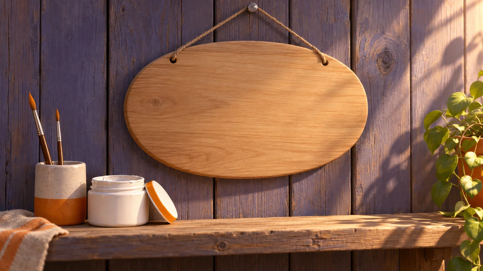
- Pick the surface. Lettering looks believable when it sits on something: a neon tube, a chalkboard, an embroidered patch, a wooden sign, frosted glass, a cake. Naming the surface tells the model what the letters are made of.
- Pick the lettering style. Bold sans-serif, flowing brush script, blocky retro, hand-painted sign writing. One style per piece.
- Describe the setting and light. "On a brick wall at night", "on a linen background in soft daylight". This is what turns text into a scene.
- Write it as one sentence, with the words in quotation marks. For example:
a hand-painted wooden sign that says "Home" in white brush script, hanging on a rustic barn door, soft morning light. - Choose the aspect ratio for where it will go (more on that below).
- Generate, then regenerate. Lettering is the part most likely to go wrong, so run the same prompt three or four times and keep the one where every letter is right.
On FreeGen that is the whole workflow: paste the prompt, pick one of the five ratios, press generate. No account, and the site advertises no watermarks as of November 2026, so what you download is clean.
Typography prompts to copy
Each prompt below is ready to paste. Swap the word in quotation marks for your own and keep the rest.
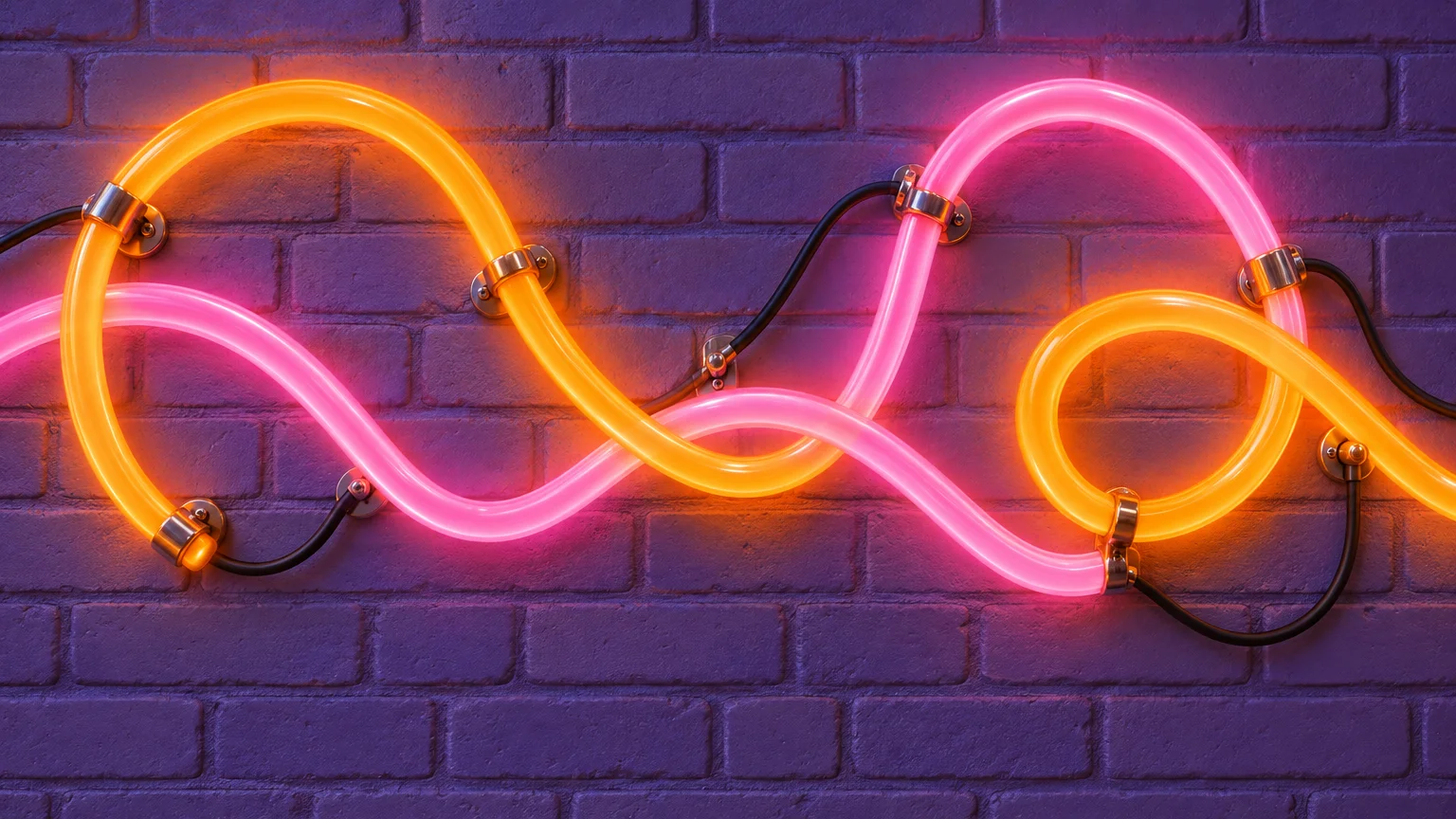
Neon and lit signs
a pink neon sign that says "Stay Weird" mounted on a dark brick wall, glowing reflections, night, photographica vintage diner sign reading "Open Late" in red and teal neon, rain on the window, cinematicwarm white marquee light bulbs spelling "PARTY" on a black backdrop, shallow depth of field
Hand lettering and chalk
the word "Grateful" in flowing brush script, black ink on cream watercolour paper, small gold leaf accents, flat laya café chalkboard with "Today's Special: Kindness" in hand-drawn chalk lettering, coffee cups on the counterthe phrase "Good Morning" in loose watercolour lettering, soft yellow and peach tones, white background
Made from materials
the word "Ocean" spelled out in seashells and sea glass on wet sand, top-down view, golden hour"Bloom" spelled in fresh flowers and leaves, arranged on a pale green table, overhead photothe name "Maya" embroidered in coral thread on a white linen hoop, close-up, natural light"Coffee" written in latte art foam on a cappuccino, wooden table, top-downthe word "Adventure" carved into a wooden plaque, deep grain, warm cabin interior
Posters and quotes
a minimalist typography poster with the words "Do Less, Better" in bold black sans-serif on an off-white background, lots of empty spacea retro 1970s poster with "Keep Going" in chunky rounded letters, orange, mustard and brown stripesa Swiss-style poster reading "Make Things" in large red letters, grid layout, clean paper texture
For more prompts that put text in a scene, the FreeGen examples gallery shows 15+ images with the full prompt beside each, including a stone cat holding a sign that reads "Free AI Generator is Cool!". Seeing the prompt next to the result is the quickest way to learn what each phrase does.
Getting the letters to read correctly
Spelling is where AI image models slip: they can produce a word that looks convincing and reads as nonsense. The problem is common enough that some AI image generators avoid generating text altogether, as Philaverse's piece on why AI image generators are bad at text points out.
These habits are practical starting points:
- Quote the exact words.
says "Hello"works better thanwith a greeting on it. - Fewer words, fewer mistakes. Each extra word is another chance for a wrong letter, so keep the phrase short.
- Start with common words. Try something like "Home" or "Love" before an unusual surname or a made-up brand.
- Ask for capitals if a word keeps breaking:
in bold capital lettersgives simpler shapes. - Give the text room. Phrases like
centered,large letters, andplain backgroundstop the model squeezing the words into a corner. - Say it once. Repeating the text in the prompt can make the model print it twice.
- Regenerate before you rewrite. Run the same prompt again before you change the wording.
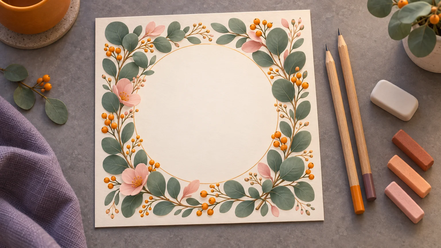
For a long quote, such as a full line of poetry or a wedding vow, split the job. Generate the background and the decoration with a prompt that asks for an empty space, like a watercolour floral frame with a blank cream centre, no text. Then add the quote yourself in any app that lets you type on a picture. You get a correct quote every time and the AI handles the part it does well.
You can also start from a reference image. FreeGen supports image-to-image: upload a photo of a sign or your own hand lettering, then describe the new style, for example the same word as glowing blue neon on a concrete wall. The upload gives the model the shape of the letters, which is worth trying with names that keep coming out wrong.
Picking a shape for the wall, the phone or the feed
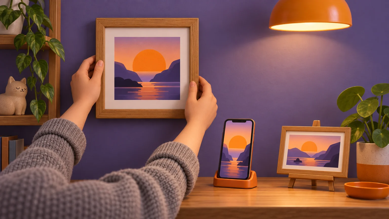
Choose the aspect ratio before you generate, not after. Cropping a finished piece usually cuts through letters, and a word missing its last letter is worse than no word at all. FreeGen offers five aspect ratios; its classic 4:3 frame comes out at 1024×768.
- Phone wallpaper or a story: use the tallest ratio offered, and ask for the words
in the middle of the frame. The clock covers the top of a lock screen and app icons cover the bottom. - Square post: use the square ratio and keep the text centred, since feeds and profile grids often trim the edges.
- Desktop wallpaper, blog header or video thumbnail: use the widest ratio and place the words to one side,
text on the left, empty space on the right, so icons or a title do not land on top of them. - Framed print or greeting card: 4:3 or a portrait ratio, with a plain margin around the lettering so a mount or frame edge does not touch it.
Printing needs one more check. Teoprint recommends 300 DPI for large canvas prints. Divide your pixel width by 300 to see how big it prints sharply: 1024 pixels gives about 3.4 inches, so a 1024×768 image makes a sharp print around 3.4 × 2.6 inches. That suits a greeting card, a gift tag or a small framed piece on a desk. For anything larger, run the image through an upscaler before you print. Simple, bold lettering on a plain background also holds up at a larger size better than fine detail does.
If you want a header or cover in an exact size, the site has guides for the X header, the LinkedIn banner and the Facebook cover, each with the safe zone where text will not be hidden.
Turning a description into a picture instead
The other meaning of words into art has no lettering in the result. You write a line from a story, a dream or a memory, and the model draws it. A diffusion model starts from random noise and removes it step by step until the image matches your text. FreeGen runs the Z-Image Turbo model to turn your description into a picture.
The trick is turning a feeling into things the model can see. "A lonely evening" is vague. This is not:
an old man reading alone at a small kitchen table, one warm lamp, rain on the dark window, painterly, muted blue and amber
A few more starting points:
a lighthouse on a cliff during a storm, waves breaking, oil painting, dramatic skya fox curled asleep in a teacup on a mossy forest floor, soft morning mist, storybook illustrationa child flying a red kite over a wheat field, late summer, film photograph
Write who or what is in the scene, where it is, the light, and the style. Fifteen to fifty words is a good length, a range LTX suggests and that the site's plain guide to AI art uses for its style-by-style prompts. If you want the full method, weak prompts rewritten into strong ones, the guide to how AI image generators work walks through it.
If you write a description and words appear anyway, add no text, no letters to the end of the prompt.
If you plan to give it or sell it
For a card, a wallpaper or a print on your own wall, you can simply use what you make. Selling is different, and the law is still settling. The US Copyright Office issued guidance on works containing AI-generated material on March 16, 2023. In August 2023 a US district court ruled AI art ineligible for copyright because it lacked human authorship.
One rule holds whoever made the image: never put someone else's trademarked slogan or a copyrighted lyric on something you sell. The guide to how AI image generators work covers ownership and commercial use in more depth, and if your word art is really a business name, the free AI logo guide deals with wordmarks and trademarks.
Frequently Asked Questions
Can AI make a portrait made entirely of words?
It can make something that looks like one, a face formed from tiny lettering, but do not count on the small words being readable. That is fine if the words are texture. If every word needs to be real, like the Darwin portrait on Mont Marte's page, the reliable route is a word-cloud or layout tool shaped to a photo, or doing it by hand.
What words work best for a first try?
Short, common words with simple letter shapes: "Home", "Hello", "Love", "Coffee", a first name. Once one of those comes out cleanly in a style you like, try longer phrases with the same prompt.
Can I put my own handwriting into an AI image?
Yes, with image-to-image. Photograph your handwritten word on plain paper, upload it as the reference image, and describe the new look, such as the same lettering as gold foil on black card. The result keeps the shape of your writing more closely than a text prompt alone.
Final Thoughts
The one choice that decides how this goes is whether the lettering is the whole piece or sits on top of a picture. If it is one to five words, let the generator draw them and regenerate until they are right. If it is a sentence or more, generate the background with a blank space and type the words in yourself. Pick one phrase from the prompts above, swap in your own words, and try it on FreeGen.