The LinkedIn banner for a personal profile is 1584 × 396 pixels. That is a 4:1 aspect ratio, uploaded as a JPG or PNG under 8 MB, as of November 2026. Those are the numbers Hootsuite lists, and the image rules LeadLoft summarises agree. There is no separate mobile size. The same file serves the desktop site and the app, and each crops it a little differently.
A Company Page cover is a different shape and a different number, and the guides disagree about which number. Both numbers and a practical way to handle them are below. So are the two parts of the banner that people get wrong most often: the corner your profile photo covers, and the edges your phone cuts off.
The size is the easy part. The harder question is what to put in that long, thin strip. Most guides send you to a template or a stock photo. This one shows how to make your own background with a free text-to-image generator, using prompts built for a 4:1 frame, and how to bring the result to 1584 × 396 without it going soft.
Every LinkedIn banner number in one place
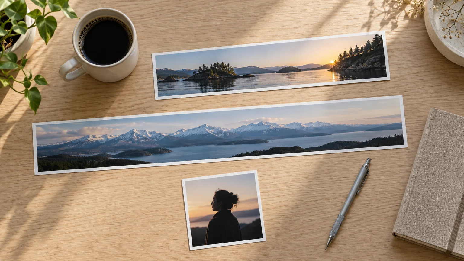
The personal banner has several names. Draftly notes it is also called the background photo, cover photo or header, and they all mean the same 1584 × 396 image. Here is the full set of sizes that sit next to it:
| Image | Size in pixels | Shape | Notes |
|---|---|---|---|
| Personal profile banner | 1584 × 396 | 4:1 | JPG or PNG, under 8 MB |
| Company Page cover | 1128 × 191 or 1512 × 256 | about 5.9:1 | Guides differ, see below |
| Company Page Life tab main image | 1128 × 376 | 3:1 | Per Figma's size guide |
| Profile photo | 400 × 400 (minimum 200 × 200) | 1:1 | Shown as a circle, max 8 MB |
Sizes checked November 2026.
A few details from FixPhotoLab's LinkedIn guide save you a re-upload. LinkedIn fills transparent areas with a solid gray box, so a PNG with a see-through background will not look the way you expect. Banners with text export best as PNG-24. Photographic banners export best as JPG at quality 85.
DPI does not matter. A 1584 × 396 file at 96 DPI works out to 16.5 × 4.1 inches, or 41.9 × 10.5 cm. But Draftly points out that the DPI setting has no effect on how sharp the banner looks on screen. Only the pixel count counts.
The Company Page cover: 1128 × 191 or 1512 × 256?
Figma and Hootsuite both list the Company Page cover as 1128 × 191 pixels. Draftly recommends designing it at 1512 × 256 and says 1128 × 191 comes from older guides.
The conflict matters less than it looks. Divide each pair and you get the same shape: 1128 ÷ 191 and 1512 ÷ 256 both come to about 5.9:1. They are one aspect ratio at two resolutions.
So the practical move is to design at 1512 × 256, as Draftly recommends. A larger file at the same 5.9:1 ratio can be scaled down to 1128 × 191 if that is the size you end up needing, so one design at that shape serves both numbers.
The Company Page cover is roughly half the height of a personal banner, at about 5.9:1 against 4:1. Don't reuse your personal banner on a Page without re-cropping it.
What actually shows: the photo overlay and the mobile trim
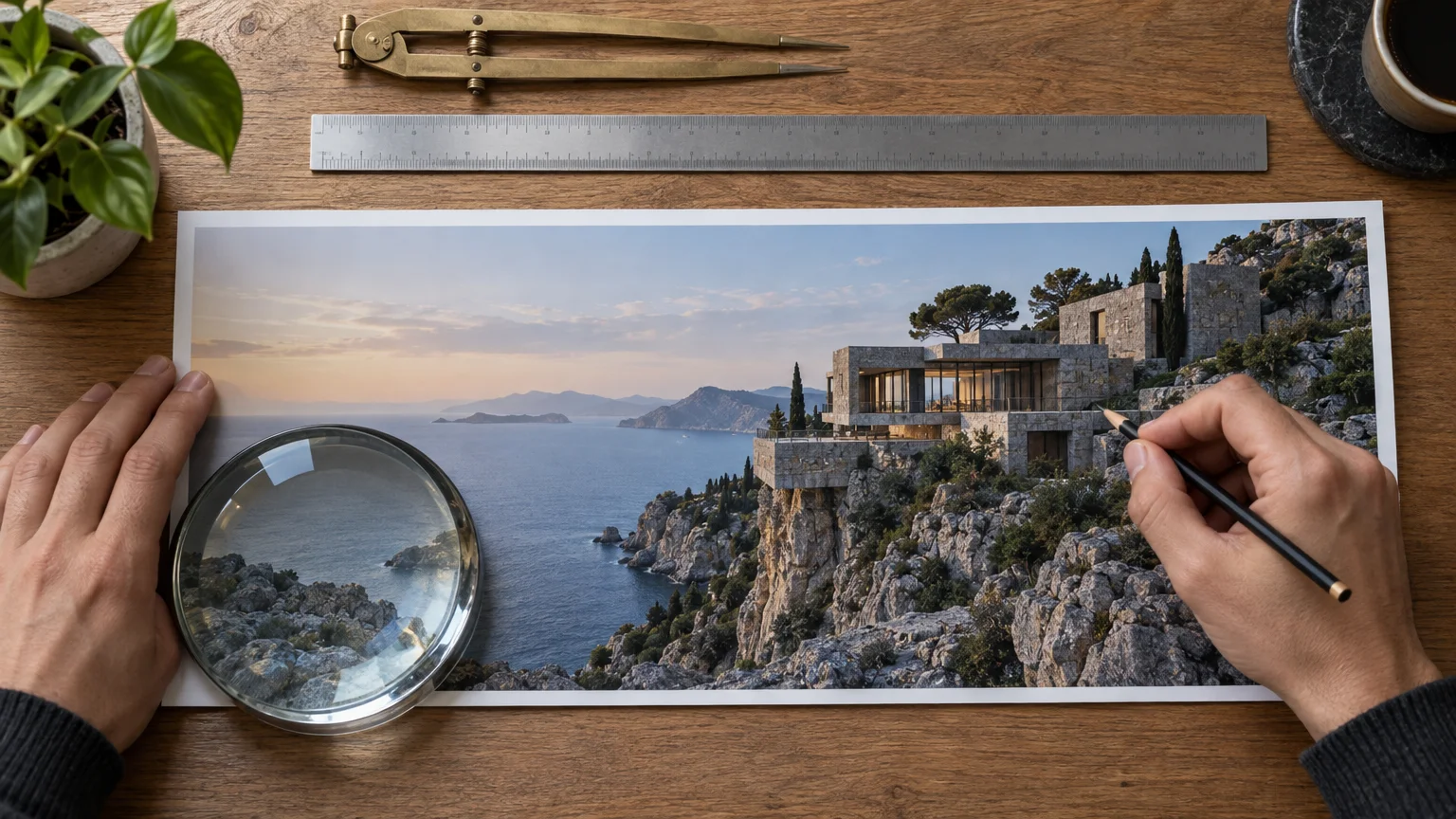
Two things hide parts of a 1584 × 396 banner.
- Your profile photo covers the lower left. FixPhotoLab treats the whole left third as covered. On a 1584-pixel-wide banner, that is the first 528 pixels.
- The mobile app trims the sides. On mobile, roughly the left 20% and the right 10% may be cut off. That is about 317 pixels from the left and about 158 pixels from the right.
The mobile trim alone leaves a band from roughly x = 317 to x = 1426, about 1,109 pixels wide, and the photo's corner eats into the lower left of that. FixPhotoLab also gives two working zones of its own. Treat them as separate rough guides, not boxes that fit neatly inside that band:
- a mobile-safe zone of roughly 1350 × 230 pixels, centered horizontally in the upper middle
- a text-safe zone of roughly 1000 × 250 pixels, right of center
The figures don't line up exactly, which shows how rough all of them are. Draftly's rule of thumb is the practical takeaway. Keep key content in the middle 60% of the width. Stay clear of the top and bottom 40 to 50 pixels. Leave the bottom-left corner empty.
These guides only give rough percentages, and the layout shifts with screen width. If you need precision, measure it on your own profile:
- Upload a test banner with a thin grid or numbered columns every 100 pixels.
- Check it on your laptop and on your phone.
- Note which columns disappear and where the photo circle lands.
Ten minutes of this beats any guide's percentages, because it measures your screens.
Making the background yourself with a free generator
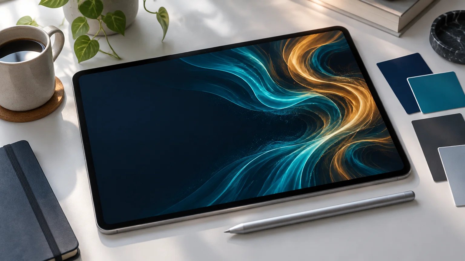
You don't need a template or a stock photo for the artwork. FreeGen is our free text-to-image generator. You type a prompt, pick an aspect ratio, and get an image back in about ten seconds, with no signup. As of November 2026, the site says there are no limits and no watermarks on what you generate.
What makes AI-generated art suit a LinkedIn banner is that you can describe the composition, not just the subject. A stock photo has its subject wherever the photographer put it. A prompt can put the interest on the right and keep the lower left plain.
How to write a prompt for a 4:1 frame
The output is wider than it is tall, but not 4:1, so you will crop a strip from it later. Write the prompt so the strip you want is easy to cut:
- Ask for a wide, horizontal scene. Use words like "panoramic", "wide horizon" and "long horizontal composition".
- Put the subject center-right. Say it outright: "main subject on the right side".
- Ask for plain space on the left. Try "empty soft background on the left" or "calm negative space in the lower left".
- Keep the middle band busy and the top and bottom quiet. Sky, floor and gradients crop away gracefully. Faces and objects don't.
- Leave out text. Image models draw lettering as convincing nonsense. If you want your name or a tagline on the banner, add it afterwards in the text-safe zone.
For more on prompt structure in general, see our guide to how AI image generators work and how to get a good image. For banners, the composition words above do most of the work.
Prompts to start from
Copy any of these into the generator as written, then change the colors or subject to suit your field.
For a calm, general professional banner:
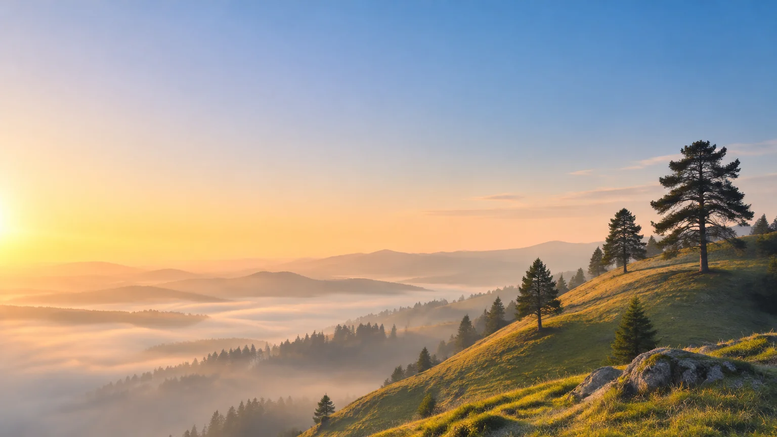
panoramic minimalist landscape at dawn, soft rolling hills, low mist, pale blue and warm peach gradient sky, main hills on the right side, empty soft sky on the left, long horizontal composition, clean and calm, photographic
For software, data or engineering:
wide abstract background of flowing thin light lines and soft glowing nodes, deep navy to teal gradient, the lines concentrated on the right half, plain dark space on the left and along the bottom, long horizontal composition, subtle and professional
For design, writing or creative work:
panoramic flat-lay of a wooden desk seen from above, sketchbook, pencils and a coffee cup arranged on the right side, large empty wooden surface on the left, soft natural window light, long horizontal composition, photographic
For architecture, real estate or construction:
wide city skyline at blue hour, modern towers clustered center-right, calm water in the foreground, open empty sky on the left, long horizontal panorama, muted colors, photographic
For health, wellness or coaching:
panoramic close-up of green leaves and soft sunlight, leaves gathered on the right side, blurred pale green background on the left, shallow depth of field, long horizontal composition, calm and fresh
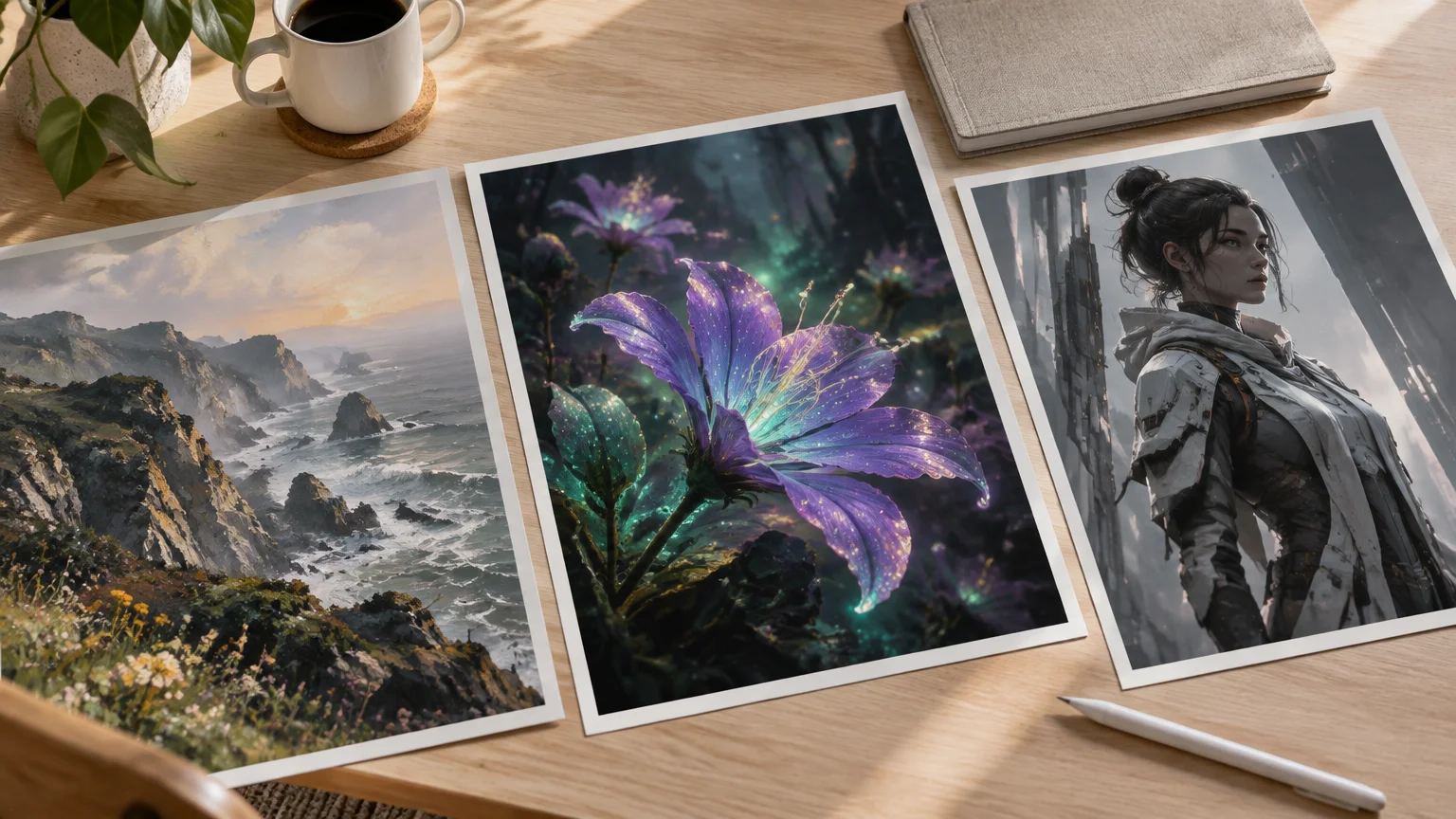
If you want to see how different wording changes the output first, the examples gallery shows more than 15 generated images next to their full prompts. It covers photographic, artistic and futuristic styles. Borrowing a style phrase from one of them is a quick way to move a banner away from looking generic.
Starting from your own photo
If you already have a photo you like, such as your city, your workplace or a view you took on holiday, upload it as a reference image and use image-to-image instead. State the change you want in the prompt:
same scene as a soft watercolor painting, muted colors, plain sky on the left
Picking a photo whose subject already sits on the right gives you less to fix when you crop the strip later.
Getting the image to 1584 × 396 without blur
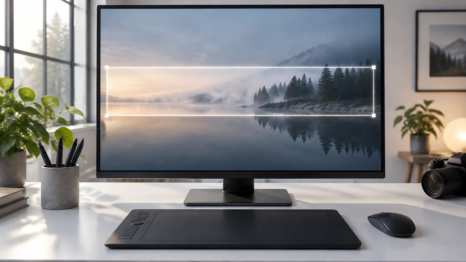
FreeGen produces a 1024 × 768 image by default. Any wide generated image needs two steps to become a banner: crop to 4:1, then resize to 1584 × 396. Do them in that order.
1. Crop a 4:1 strip. From a 1024 × 768 image, the widest 4:1 strip you can cut is 1024 × 256 pixels. Pick the band that holds your subject on the right and plain space on the left. Usually that band sits slightly above or below center. If you generated at a wider aspect ratio, your strip can be taller and you keep more detail.
2. Upscale to 1584 × 396. Going from 1024 to 1584 pixels wide is about 1.55× magnification. That is a modest jump. Upscaling beyond 4× rarely produces good results, and you are well inside it. What matters is the resampling method:
- Bicubic estimates each new pixel from a 4 × 4 grid of neighbouring pixels. It gives smooth results and is available almost everywhere.
- Lanczos interpolates using a sinc function. It usually holds edges and fine texture a little better at this kind of enlargement.
Do the enlarging yourself and upload the finished 1584 × 396 file, rather than a smaller strip.
3. Export. Use JPG at quality 85 for a photographic banner, or PNG-24 if you added text. Check that the file is under 8 MB. At 1584 × 396 it almost always is.
The prompts above help here too. Soft skies, mist, gradients and shallow depth of field enlarge more gracefully than crisp fine detail, because there is less fine detail to smear. If you plan to put text over the background, choose one of the softer prompts.
Uploading it
On a computer, open your profile and upload the 1584 × 396 file to the banner area. Then open the LinkedIn app on your phone and look again. Hootsuite notes that the cover is cropped differently on mobile and desktop, so check both.
If the subject sits behind your photo or gets trimmed on mobile, don't try to fix it at upload. Cut a different strip from the same generated image, or regenerate with a stronger "subject on the right" instruction. It takes about ten seconds.
If you are doing your Facebook profile in the same sitting, that cover is a different shape with its own crop rules. Our Facebook cover photo size guide covers it.
Frequently Asked Questions
What size is the LinkedIn banner?
The personal profile banner is 1584 × 396 pixels, a 4:1 aspect ratio, in JPG or PNG under 8 MB, as of November 2026. There is one size for both desktop and mobile. The app crops the sides, so keep important content near the center.
Is 1920 × 1080 good for LinkedIn?
Not for the banner. A 1920 × 1080 image is 16:9, and LinkedIn crops it to 4:1, which cuts away most of its height. Crop it to a 4:1 strip yourself first, such as 1920 × 480, then resize it to 1584 × 396, so you choose what stays.
How do I make a picture fit my LinkedIn banner?
Crop it to a 4:1 strip, then resize that strip to exactly 1584 × 396 pixels. Choose the strip so the main subject is center-right and the bottom-left is plain, because your profile photo sits there. Upload the finished file and check it on your phone as well as your computer.
How can I convert an image to LinkedIn banner size?
Any image editor that can crop to a fixed ratio and resize will do it. Set the crop to 4:1, then resize to 1584 × 396 using bicubic or Lanczos resampling. If the strip is smaller than 1584 pixels wide, keep the enlargement modest, since going beyond about 4× rarely looks good.
Why does my banner look blurry after uploading?
Usually the file was smaller than 1584 × 396, or a heavily compressed JPG was compressed again. Upload a file at exactly 1584 × 396. Export photographic banners as JPG at quality 85, and banners with text as PNG-24.
Why is the main part of my banner hidden?
Your profile photo covers the lower left, roughly the left third of the banner. The mobile app can also trim about 20% from the left and 10% from the right. Move the subject center-right, or generate art that puts it there, and keep the bottom-left empty.
What size is the LinkedIn Company Page cover?
Figma and Hootsuite list 1128 × 191 pixels, while Draftly recommends 1512 × 256. Both work out to the same shape, about 5.9:1. Designing at 1512 × 256 works, and a larger file at that ratio can be scaled down if you need the smaller size.
Can I use a transparent PNG as my banner?
You can upload one, but LinkedIn fills transparent areas with a solid gray box. Flatten the image onto a background color you chose before uploading.
Final Thoughts
The number to remember is 1584 × 396. The rule to remember is that the lower left belongs to your profile photo and the far edges belong to whatever your phone decides to cut. Everything else follows from those two facts.
The background itself doesn't have to be a template thousands of other profiles share. Write a prompt that puts the subject on the right and leaves the left quiet, crop a 4:1 strip, and enlarge it gently to size. You can try the first one now in FreeGen, free and with no signup. If you would rather start from a look you like, browse the examples gallery and adapt one of its prompts.