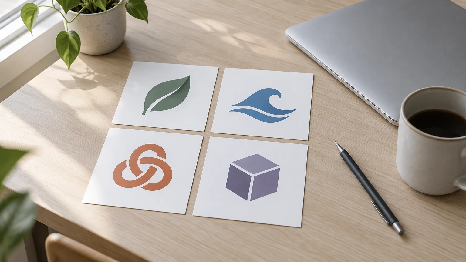
Yes, you can make a logo with AI for free. But "free" means different things depending on where you go. Most dedicated logo makers let you design at no cost and charge when you download. According to Designlab's review of AI logo generators, Looka downloads start around $20 as of November 2026. A general text-to-image generator works the other way round: you write the prompt, and the image it gives you is the file you keep.
That is how FreeGen works. You type a prompt, and about ten seconds later you have a 1024×768 image, with no account. The site states there is no watermark. What you don't get is a vector file. FreeGen outputs images, not SVGs, so a logo from it is a draft you finish in a few extra steps. Those steps are below.
This guide gives you prompts to copy for each type of logo and the steps that turn a draft into usable files. It also covers the part most roundups skip: the ownership questions to ask before you build a brand on the result.
What "free" actually gets you
The short version: free routes either give you the full image with no vector, or let you design for free and charge for the files. Here is how the common options split, using the figures in Designlab's review and FreeGen's own statements.
| Route | What is free | What costs money | Output |
|---|---|---|---|
| FreeGen | Full image, no signup, no watermark (per the site) | Nothing stated | 1024×768 raster image |
| Looka | Designing | Downloads from about $20, brand kits up to $80 or more | Files after purchase |
| Brandmark | Not stated in the review | One-time logo from $25, enterprise up to $175 | Files after purchase |
| Tailor Brands | A low-res download | High-res with subscriptions from about $10/month | Low-res free, high-res paid |
| Logo.com | One logo download | Additional files from around $8 | Icons pulled from a library (2024 assessment) |
| Ideogram | 10 credits a week, slower queue | Plans from $8/month | High-res PNG, not SVG |
| Recraft | Limited credits | Plans from around $12/month | Real, scalable SVG |
Prices checked November 2026.
Two things stand out. First, the template-style makers are where people usually hit the paywall, at the download step after twenty minutes of designing. Second, almost every AI route produces a raster image. Designlab describes Recraft as the only major AI image model that outputs real SVG vectors. Everything else, FreeGen included, gives you pixels that you vectorize yourself if you need a scalable master file.
That makes a free image generator a sensible first stop. You can try twenty ideas in a few minutes without an account or a meter running. Then you spend effort only on the one you keep.
Prompts for each type of logo
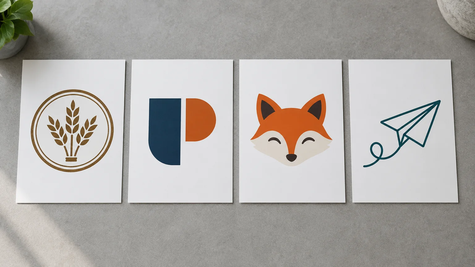
A logo prompt works best when it names five things: the logo type, the exact text in quotes, the symbol, the style, and two or three colours. It should also ask for a plain white background and nothing else in the frame. Asking for "flat vector style" matters even though the output is a raster image. It pushes the model toward clean edges and solid fills, which are much easier to vectorize later.
Each prompt below is ready to paste into FreeGen. Swap in your own name, symbol and colours.
Wordmark
The business name is the logo. It suits short, distinctive names.
Minimal wordmark logo reading "Juniper", clean geometric sans-serif lettering, dark forest green on a plain white background, flat vector style, centered, no other text
Lettermark
This uses initials only. It is useful when the full name is long.
Lettermark logo of the letters "JB" interlocked, bold serif monogram, navy blue, flat design, plain white background, centered, generous margin around the letters
Emblem
The name sits inside a badge or seal. It is common for cafés, breweries and trades.
Circular emblem logo for a bakery called "Rise", a wheat stalk in the center, the word "RISE" curved along the top of the badge, vintage stamp style, two colors only: cream and brown, plain white background
Mascot
This is a character. It works well for food, kids' products and gaming channels.
Friendly mascot logo of a cartoon fox wearing a chef's hat, thick outlines, flat colors, orange and charcoal, sticker style, plain white background, no text
Icon only
This is a symbol with no lettering. It is the piece that ends up as an app icon or profile picture.
Simple icon logo of a paper airplane drawn as a single continuous line, flat vector style, teal on a white background, no text, centered, readable at small sizes
Combination mark
This pairs an icon with the name. It is the most common layout for small businesses.
Logo for a dog-walking business called "Paw Trail": a paw print icon on the left, the words "Paw Trail" in rounded bold sans-serif on the right, flat design, green and white, plain white background
Match the aspect ratio to the logo's shape. A square ratio suits icons, lettermarks, emblems and mascots. A wide ratio gives a horizontal wordmark or combination mark room to breathe, so it isn't squeezed.
Getting a cleaner draft
The usual failure in an AI logo is the text. Image models used to be poor at lettering. Designlab notes that when it first reviewed these tools in early 2024, DALL-E and Midjourney could not render text reliably. Newer models handle it far better. You can see readable sign text in the prompts shown on the FreeGen examples gallery. Even so, these habits help:
- Keep the text short. One or two words render more reliably than a full name plus a tagline. Leave the tagline out of the prompt and add it later.
- Put the exact text in quotes, and spell out capitals if they matter:
the word "RISE" in capital letters. - Check every letter at full size. A doubled letter or a missing curve is easy to miss in a thumbnail and very obvious on a printed sign.
- Split the job if the lettering keeps failing. Generate the icon with
no text, then set your name next to it in any free design app using a real font. You get exact spelling and a font you can reuse on your menu, website and invoices. - Change one thing at a time. If the colours are right but the symbol is wrong, keep the prompt and change only the symbol phrase. If the result looks generic, add a concrete detail:
a wheat stalk with three grainsrather thana bakery symbol.
If you already have a sketch on paper, photograph it and use it as a reference image. Image-to-image keeps your basic shape and lets the prompt set the finish. For example: clean flat vector version of this sketch, solid black lines, white background. This is often the fastest route for people who know roughly what they want but can't draw it neatly.
For more on how prompts and reference images work in general, see our guide to how AI image generators work.
From draft to usable files
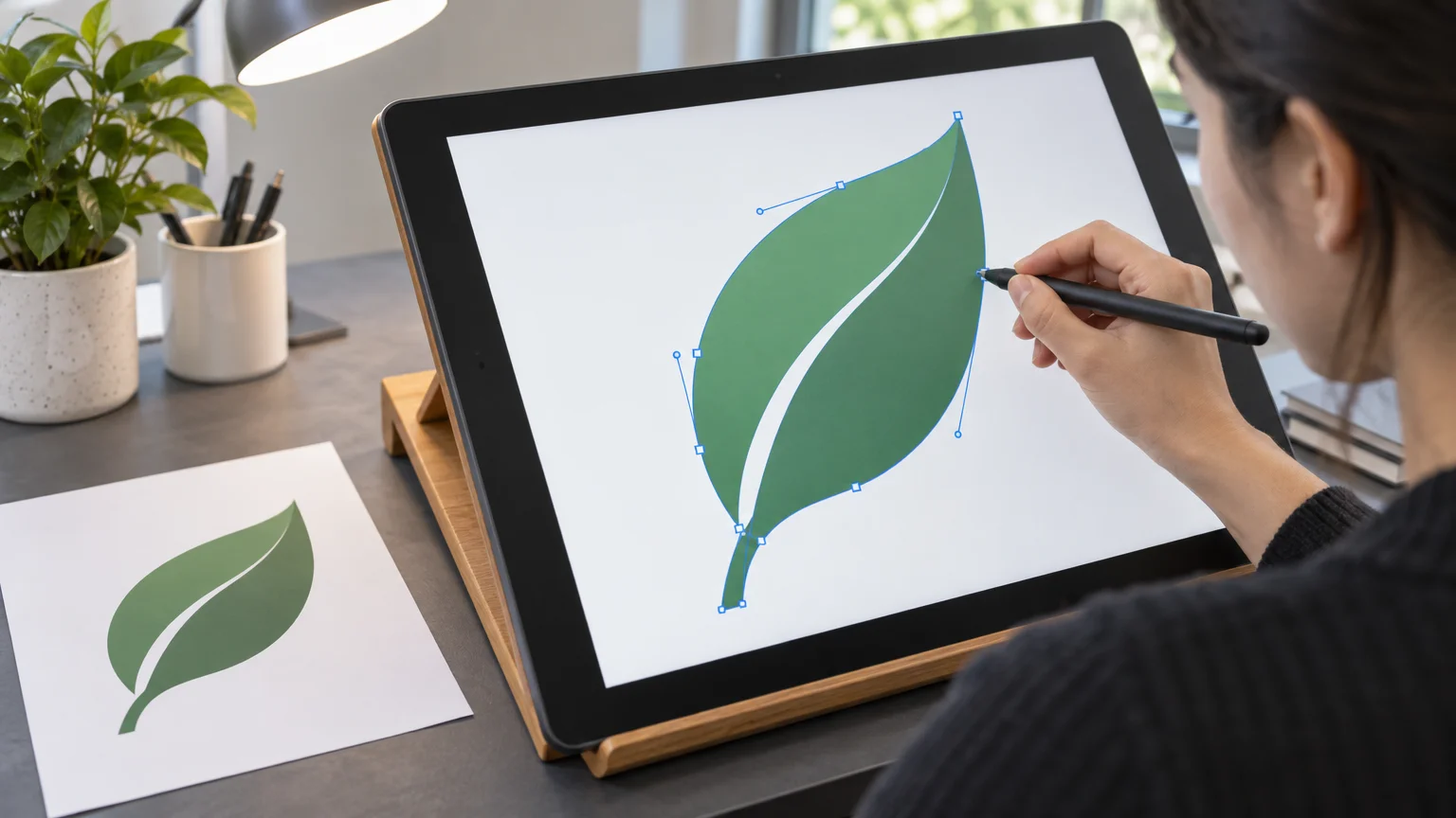
A generated logo is a picture on a white background. A usable logo is a small set of files: a transparent PNG for the web, a vector for print, and a few size variants. Getting there takes three steps.
A transparent background
You asked for a plain white background, so removing it is easy. Run the image through any background-removal tool. Or open it in an image editor, select the white with a colour-select tool and delete it. Export as PNG, because JPG cannot hold transparency. Then check the edges on a dark background. A faint white halo around the letters means the selection needs to be tightened a little.
A vector version
Print shops, sign makers and embroidery services usually want a vector file (SVG, EPS or PDF). You can trace your raster draft into one in a vector editor. Flat logos with two or three solid colours trace cleanly. Gradients, shadows and fine texture do not, which is why the prompts above keep the style flat. After tracing, zoom in and tidy wobbly curves. If the lettering came out slightly uneven, replace it with real type at this stage.
The sizes you need
A draft at 1024×768 pixels is fine for a profile picture or a website header. For print, the usual target is 300 pixels per inch at the printed size. At that density, 1024 pixels covers only about 3.4 inches, so anything larger needs the vector version. At minimum, keep:
- the full logo, transparent PNG and vector
- a square icon-only version for profile pictures and app icons
- a one-colour version, in black and in white, for stamps, single-colour printing and dark backgrounds
Before you commit, shrink the icon to about 32 pixels wide, the size of a browser tab icon. If you can't tell what it is at that size, simplify it.
Checking it isn't someone else's logo
An image model has seen a huge number of existing designs. A simple icon, like a leaf in a circle or a stylised mountain, can come out very close to a mark a real company already uses. Check for this before you print anything:
- Run a reverse image search on your final logo with Google Lens or TinEye. Look for near-matches, especially in your own industry.
- Search the USPTO's free trademark database. Search your business name, and look through registered design marks in your category. Searching by the name is easy. Browsing design marks takes longer but catches lookalike symbols.
- Search your name plus your trade in an ordinary web search and on the social platforms you plan to use.
- Never prompt with another brand's name or style. "In the style of" a famous logo is the fastest way to produce something that looks like it.
If you find something close, change the symbol or the colours and regenerate. A few more minutes now costs far less than reprinting signage later.
Who owns it: copyright, trademark and commercial use
This section covers the questions in plain terms. It is not legal advice. If you are registering a brand you plan to build a business on, an hour with a trademark attorney is worth paying for.
Copyright. You will often hear that copyright is about human authorship, and that an image generated from a prompt alone may not be protectable while the changes you make yourself can be. How that applies to your logo is a question for an attorney, not a blog post. In practice, the more of the final logo you shape yourself, through redrawn lettering, your own arrangement and hand edits, the more of it is genuinely your work.
Trademark. Trademark is a separate system, and for a logo it often matters more. It protects the marks that identify your business to customers. People commonly say that what counts is whether a mark is distinctive and unlikely to be confused with an existing one, rather than who drew it. Whether that holds for your mark is exactly what an attorney can tell you. Either way, it is why the resemblance check above matters so much.
Commercial use. Whether you can use the output commercially is set by each tool's terms, and free tiers do not always carry the same rights as paid plans. Before the logo goes on packaging or a shopfront, read the terms of whichever tool made it, FreeGen included. The broader question of owning and selling AI images is covered in our general guide.
Frequently Asked Questions
Can I trademark a logo made with AI?
Possibly, but that is a question for a trademark attorney rather than a general guide. It is commonly said that trademark turns on distinctiveness and the risk of confusion rather than on who drew the mark. Whatever the answer for your mark, search the USPTO database first, because AI logos can resemble marks that already exist.
Can I copyright an AI-generated logo?
It is often said that the purely generated part can't be, because copyright is about human authorship, while your own edits may be. Treat that as a starting point for a conversation with an attorney, not a ruling. Reworking the draft by hand also makes the logo more distinctly yours.
Is a free AI logo good enough for a real business?
As a starting point, often yes, especially for a side business, a market stall or a new channel. What separates a draft from a finished logo is the finishing work: a clean vector, a transparent PNG, a one-colour version and a resemblance check. None of that requires paying for a logo tool.
Why is my business name misspelled in the logo?
Image models still slip on longer words and unusual spellings. Shorten the text, put it in quotes, and regenerate. Or generate the icon with no text and add the name yourself in a real font.
How do I get a transparent background?
Prompt for a plain white background, then remove the white with a background-removal tool or an editor's colour-select. Save as PNG, not JPG, and check the edges against a dark colour.
Can I turn my own sketch into a logo?
Yes. Photograph the sketch, upload it as a reference image, and describe the finish you want, such as flat vector style, solid colours and a white background. Image-to-image keeps your shape and cleans up the drawing.
What file formats will I need?
A transparent PNG for websites and social profiles, and a vector file (SVG, EPS or PDF) for print, signs and merchandise. Keep a square icon version and black and white versions too.
Is a 1024×768 image big enough for a logo?
For screens, yes. For print it covers only about 3.4 inches at 300 pixels per inch, so trace it into a vector before anything larger goes to a printer.
Final Thoughts
The cheapest way to a logo is to separate the ideas from the files. Use a free generator to explore. A wordmark, an emblem and a mascot cost you nothing but a minute each. Pay with your time, not your card, for the finishing: transparency, a traced vector, a resemblance check and a conversation about ownership before you register anything.
Pick one of the prompts above, put your own name in the quotes, and try it on FreeGen. If you want ideas for wording, the examples gallery shows the full prompt behind every image.